

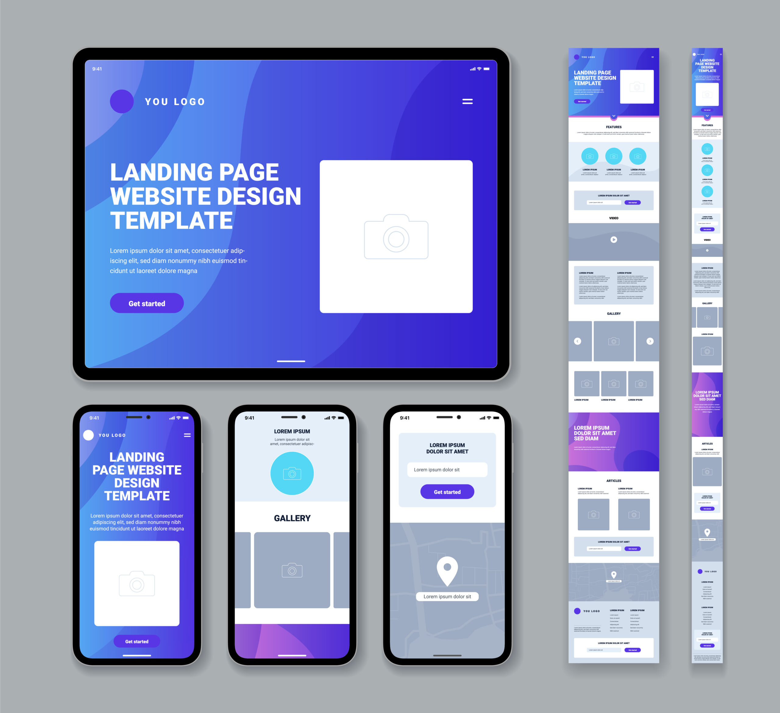
In the ever-evolving landscape of the internet, where users access websites through an array of devices, the importance of responsive design has reached new heights in 2023. As we delve into the intricacies of web design, it becomes evident that creating a website that seamlessly adapts to various screen sizes is not just a trend but a necessity. This comprehensive guide explores why responsive design is crucial, how to implement it effectively, the benefits it brings, and additional tips to ensure your website stands out in the digital realm.
Why is Responsive Design Important?
1. Increased Mobile Usage
The digital era is characterized by the dominance of mobile devices. According to StatCounter, over 50% of internet traffic is now generated through mobile devices. Ignoring the optimization of your website for mobile users means neglecting a substantial portion of your potential audience. Responsive design ensures that your site is not only accessible but also user-friendly on smartphones and tablets.
2. Improved User Experience
User experience (UX) is paramount in retaining visitors and encouraging engagement. A responsive website guarantees a consistent and enjoyable experience across all devices. Whether your audience is using a desktop computer, laptop, tablet, or smartphone, the design adapts, providing smooth navigation and interaction. This adaptability fosters a positive perception of your brand, as users appreciate a seamless experience.
3. Improved SEO
Search engine optimization (SEO) is a critical aspect of online visibility. Search engines, particularly Google, favor responsive websites. This preference stems from the belief that responsive sites are more likely to provide a positive user experience. Google’s algorithms consider user experience as a ranking factor, making responsive design a strategic choice to enhance your website’s visibility in search engine results.
How to Implement Responsive Design
CSS Media Queries
The cornerstone of responsive design lies in CSS media queries. These queries enable web designers to apply different styles to a website based on the user’s device or screen size. By utilizing media queries effectively, you can create a single, dynamic website that seamlessly adjusts its layout and styling to suit various devices. This approach eliminates the need for creating separate versions of your site for different platforms.
Benefits of Responsive Design
1. Improved User Experience
A responsive website ensures that users enjoy a consistent and high-quality experience, regardless of the device they choose. This consistency builds trust and loyalty among visitors.
2. Increased Website Traffic
Search engines prioritize responsive websites, leading to higher rankings in search engine results pages (SERPs). A higher ranking translates to increased visibility and, subsequently, more organic traffic.
3. Reduced Website Development Costs
Creating and maintaining separate versions of a website for different devices can be resource-intensive. Responsive design streamlines the development process, reducing costs and efforts associated with managing multiple versions.
4. Improved Brand Image
A website that adapts to the latest design standards signals that your brand is modern, forward-thinking, and attentive to user needs. A positive online presence contributes to an enhanced brand image.
Additional Tips for Creating a Responsive Website
1. Fluid Grid Layout
Utilize a fluid grid layout that adapts to different screen sizes. This ensures that your content is presented in an organized and visually appealing manner, regardless of the device.
2. Flexible Images
Optimize images to be flexible and responsive to various screen dimensions. This prevents images from being distorted or taking up excessive space on smaller screens.
3. Media Queries
Leverage CSS media queries to style your website for different devices. This allows you to tailor the presentation of your content to suit the specific characteristics of each device.
4. Device Testing
Regularly test your website on a variety of devices to ensure consistent functionality and appearance. This proactive approach helps identify and address any potential issues, ensuring a seamless user experience across the board.
By incorporating these additional tips into your responsive design strategy, you can create a website that not only meets the needs of your diverse audience but also positions your brand as a leader in the digital landscape. Stay ahead of the curve in 2023 by making responsive design a central focus of your online presence.
Conclusion
In 2023, responsive design transcends being a mere design trend; it stands as a fundamental prerequisite for achieving online success. The repercussions of neglecting its implementation extend beyond aesthetics, potentially excluding a substantial portion of your audience and limiting your website’s potential reach. Embracing responsive design becomes not just a choice but a strategic imperative, ensuring your site delivers a seamless, user-centric experience across diverse devices. This commitment resonates in increased traffic, bolstered SEO rankings, and an elevated brand image, solidifying your position as a forward-thinking entity in the dynamic digital landscape. Stay responsive, stay relevant.