

In the dynamic landscape of web development, staying ahead of the curve is paramount. One of the most influential shifts in recent years has been the adoption of mobile-first design principles. As smartphones and tablets become the primary devices for accessing the internet, understanding the impact of mobile-first design is crucial for businesses and developers alike.
Introduction
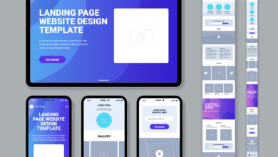
The term “Mobile-First Design” refers to the approach of designing a website starting from the smallest screens, typically mobile devices, and then progressively enhancing the design for larger screens like tablets and desktops. This approach has gained prominence due to the exponential increase in mobile device usage globally. According to recent statistics, mobile devices account for a significant portion of web traffic, emphasizing the need for websites to be optimized for smaller screens.
Why Mobile-First Design Matters
Growing Mobile Usage Statistics
The proliferation of smartphones has led to a seismic shift in internet usage patterns. Mobile devices have become the go-to choice for browsing, shopping, and accessing information. As a result, websites that prioritize mobile users are better positioned to reach and engage a broader audience.
Importance of User Experience (UX) on Mobile Devices
User experience is a pivotal factor in the success of any website. Mobile users have distinct needs and expectations compared to desktop users. Mobile-first design places a focus on delivering a seamless and intuitive experience for users on smaller screens, leading to higher satisfaction and increased retention rates.
Google’s Mobile-First Indexing and SEO
Search engine optimization (SEO) is a critical aspect of Web Design and development, and Google, being the predominant search engine, has adapted to the mobile-first trend. Google’s mobile-first indexing prioritizes the mobile version of a website for ranking and indexing. Websites optimized for mobile are more likely to rank higher in search results, making mobile-first design an essential consideration for SEO strategies.
Key Principles of Mobile-First Design
Content Prioritization for Small Screens
In a mobile-first approach, designers and developers prioritize essential content and features for mobile users. This ensures that users on smaller screens get access to the most crucial information without clutter or unnecessary elements. This principle encourages a more focused and user-centric design.
Responsive Design vs. Mobile-First Design
While responsive design aims to adapt a website to different screen sizes, mobile-first design takes this a step further by starting the design process with mobile devices. This approach ensures that the core functionality and user experience are optimized for mobile, providing a solid foundation for expansion to larger screens.
Touch-Friendly Navigation and Interactions
Mobile users interact with websites using touch gestures. Mobile-first design incorporates touch-friendly navigation and interactions, making it easy for users to navigate through the site on touchscreens. This includes larger buttons, simplified menus, and gestures that enhance the overall user experience on mobile devices.
Benefits of Mobile-First Design in Web Development
Improved Page Load Speed on Mobile Devices
Page load speed is a crucial factor in user satisfaction and SEO. Mobile-first design often leads to lightweight and optimized websites, resulting in faster load times on mobile devices. Faster loading pages contribute to a positive user experience and can positively impact search engine rankings.
Enhanced User Engagement and Conversion Rates
Websites optimized for mobile tend to have higher user engagement and conversion rates. Users are more likely to stay on a site, explore its content, and complete desired actions when the design caters to the specific needs of mobile users. This can have a direct impact on a website’s success, especially for e-commerce and service-oriented businesses.
Adaptability to Various Screen Sizes and Devices
The mobile-first approach inherently promotes adaptability. As the design starts with the smallest screens, it ensures that the website is capable of scaling seamlessly to larger screens. This adaptability is essential in a world where users access websites on a diverse range of devices, including smartphones, tablets, laptops, and desktops.
Challenges and Considerations
Addressing Design and Functionality Trade-Offs
While mobile-first design brings numerous advantages, it may pose challenges when it comes to incorporating complex features or intricate design elements. Striking the right balance between design aesthetics and functionality can be a consideration that developers need to navigate.
Testing and Debugging for Multiple Devices
Ensuring a consistent and optimal experience across various devices requires thorough testing. Mobile-first design necessitates testing on a range of devices to identify and rectify any issues related to responsiveness, performance, or user interactions. This additional testing phase is an investment that pays off in delivering a polished product.
Balancing Desktop and Mobile Experiences
While prioritizing mobile users, it’s essential not to neglect the desktop experience. Many users still access websites from desktops, and neglecting this user base can lead to missed opportunities. Striking a balance between mobile and desktop experiences is crucial for catering to the diverse preferences of users.
Tools and Frameworks for Mobile-First Development
To facilitate the implementation of mobile-first design, several tools and frameworks are available in the web development arsenal. These include popular frameworks like Bootstrap and Foundation, which provide responsive grid systems and components that simplify the mobile-first development process. Utilizing these tools can expedite the creation of mobile-friendly websites without compromising on design or functionality.
Case Studies: Successful Mobile-First Design Implementations
Examining real-world examples can provide insights into the effectiveness of mobile-first design. Numerous businesses and organizations have witnessed significant improvements in user engagement and conversion rates after adopting a mobile-first approach. For instance, cswebsolutions.ca saw a 92% increase in mobile conversions within 3 months of implementing mobile-first design principles.
Future Trends in Mobile-First Design
As technology continues to evolve, the future of mobile-first design holds exciting possibilities. Emerging technologies such as augmented reality (AR) and voice interactions are likely to influence the way websites are designed for mobile users. Staying attuned to these trends will be crucial for developers seeking to stay ahead of the curve.
Conclusion
In conclusion, the impact of mobile-first design on web development is undeniable. With the majority of internet users relying on mobile devices, adopting a mobile-first approach is no longer a choice but a necessity. From improved user experience and SEO benefits to enhanced engagement and adaptability, the advantages of prioritizing mobile users reverberate across the entire web development landscape. As we look to the future, embracing and evolving with mobile-first design trends will be key to creating websites that resonate with users in an increasingly mobile-centric world.